Introduction to Widgets
This feature was introduced in CKEditor 4.3. It is provided through an optional plugin that is not included in the CKEditor 4 presets available from the Download site and needs to be added to your custom build with online builder.
Widgets are special rich content units in that they are groups of elements which are treated as a single entity inside the editor.
Once developed, their structure (but not necessarily their content) is immutable and enforced by the CKEditor 4 instance they are used in. These entities can thus be selected and deleted or moved freely as a whole around the editing area, keeping their predefined structure intact. At the same time all the individual parts of the widget (its “building blocks”) can be edited or configured separately, again, without affecting the whole widget entity and its structure in the process.
# Benefits
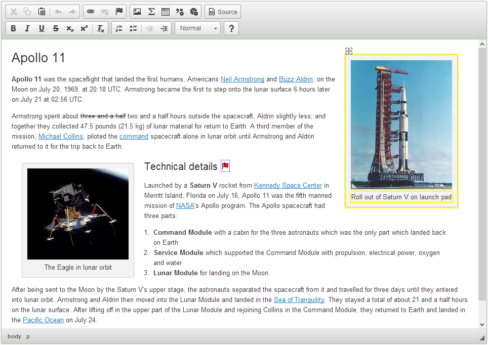
To illustrate this concept with an example, let us consider a basic captioned image widget.

The screenshot above shows the editor with two captioned image widget instances. The right one (Saturn V launch) is hovered, so a characteristic yellow frame marks editable areas and a drag icon appears.
In the simplest scenario, this widget consists of a caption and an image. The caption conceptually belongs to the image and must not exist outside this context. Creating a captioned image as an independent entity gives you a number of benefits, such as:
- The ability to select and delete the whole widget instance without a potential risk of e.g. deleting just the image and leaving a stray caption behind.
- The ability to move the widget instance inside the editor and to position it by using drag&drop.
- The ability to easily enforce consistent styling for the entire widget instead of having to manually maintain styling of its building blocks separately.
- The ability to create a common context menu or dialog window that can be used to edit the properties of all editable elements of the widget.
- The ability to easily maintain the same look and feel for content that may be repeated multiple times in the document.
Another powerful aspect of widgets is the ability to isolate them from the rest of the editor content. This allows you to configure the widget elements separately from the remaining editor content, for example limiting the styling features available for the image caption to just bold font and links and disallowing using lists and tables that do not make sense in this context.
This also means that if a widget needs an external library to work (for example to generate mathematical formulae), the library’s code will not interfere with the rest of the editor content.
# Common Usage Scenarios
Widgets are useful in all situations where you need to build a predefined structure of elements that can be easily and effectively reused within the editor content (or between more editor instances) and at the same time cannot be changed or accidentally destroyed by the user. This can be taken advantage of in the following example scenarios:
- Document templates that need to preserve the same form and just enable the user to fill in the designated parts.
- Block quotations with a caption that gives the quotation author and source.
- Annotations or references with source.
- Text blocks that should be repeated in multiple places across the page or pages with the same structure and styling.

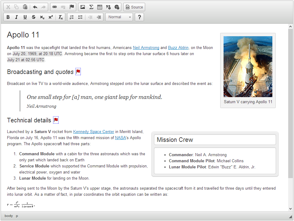
The screenshot above shows a customized CKEditor 4 instance that uses a few sample widgets: a captioned image (“Saturn V carrying Apollo 11”), a captioned quotation (Neil Armstrong’s words), a simple box template (listing the mission crew), mathematical formula (orbit equation) as well as the dates inserted inline in the first paragraph.
# Technical Background
Technically, each widget is defined in a CKEditor plugin that uses the features provided by the generic Widget plugin. Owing to this, widget plugins have a structure very similar to that of standard editor plugins, can be made available in CKEditor 4 Add-ons Repository, and can be added to your editor installation as described in the Widget Installation article.
# Accessibility
When a widget is selected, the keyboard shortcuts are adjusted to make the navigation and content editing around the widget more comfortable. For example, a widget dialog window can be opened by just pressing the Enter key. All shortcuts are described in the Keyboard Shortcuts guide.
# Further Reading
If you want to create your own widgets, take a look at the Widget SDK that includes a step-by-step tutorial on how to create widgets.


