Setting Text and Background Color
This feature is provided through optional plugins that are only included in the Full preset available from the official CKEditor 4 Download site. You can also add them to your custom build with the online builder.
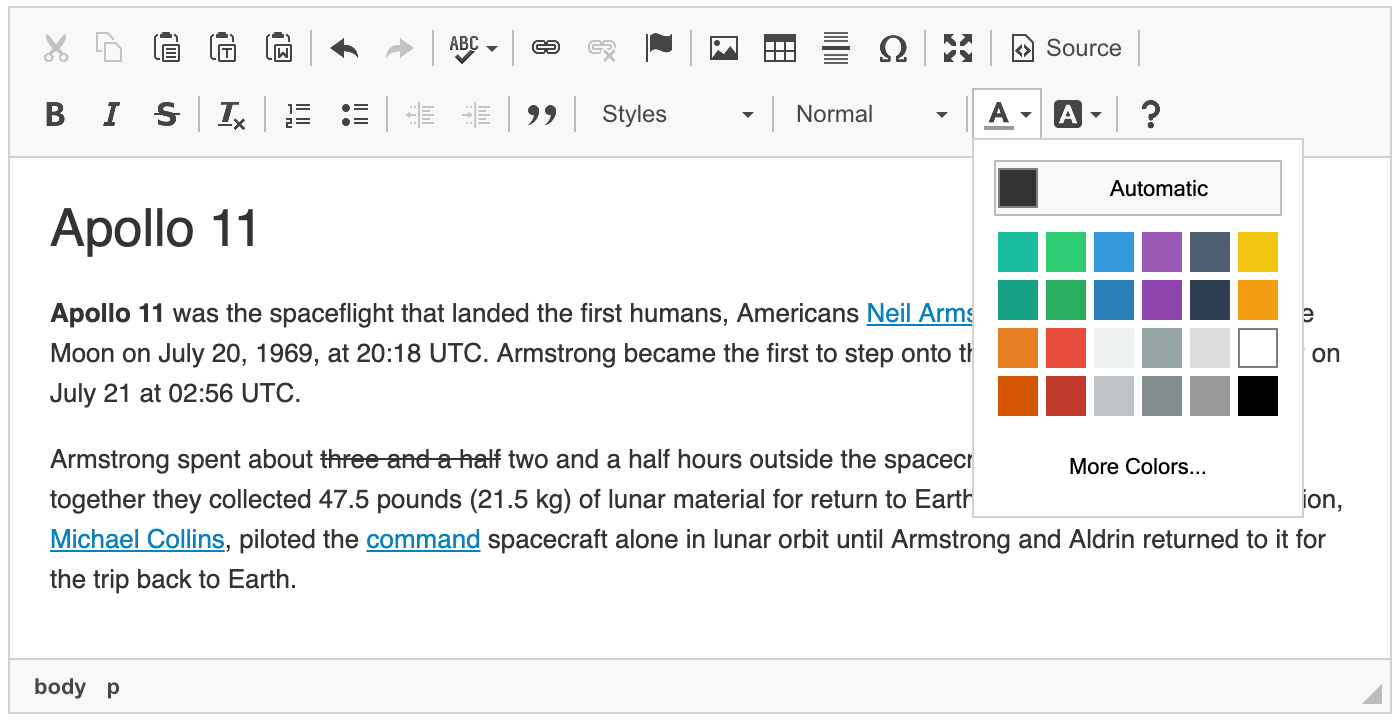
The optional Color Button plugin provides the ability to define the font and background colors for text created in CKEditor 4. When enabled, it adds the Text Color and Background Color toolbar buttons that open a color selection drop-down list. If you want to quickly remove colors from your document, use the Remove Format button provided by the Remove Format plugin.
# More Colors Option and Color Dialog
You can also add the optional Color Dialog plugin which extends the color selector with the More Colors option and a user-friendly way to select the desired color through a dedicated Select Color dialog window. When this plugin is enabled, the More Colors option appears automatically for the text and background color.
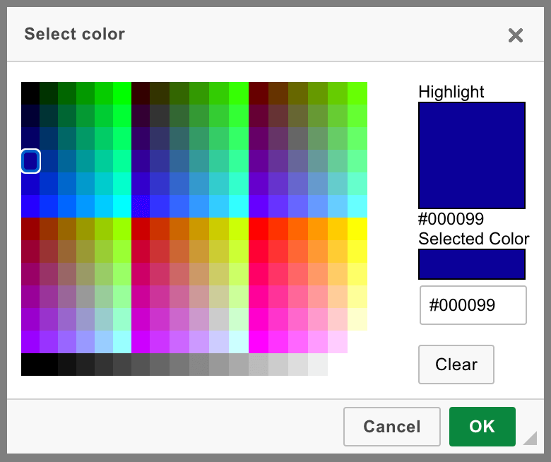
You can hide the More Colors feature by setting the config.colorButton_enableMore configuration option to false.
# Custom Color List
The list of colors available in the color selectors can be customized, for example to include the colors that are used in your website. You may also want to limit user’s choice of colors to just selected few in order to avoid the overuse of colors.
Use the config.colorButton_colors configuration option to define a custom list available in the Text Color and Background Color features. For example:
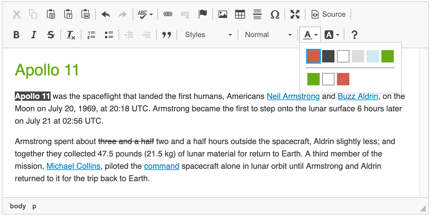
config.colorButton_colors = 'CF5D4E,454545,FFF,DDD,CCEAEE,66AB16';
Additionally, since CKEditor 4.5.8 you can also disable the “Automatic” option by setting the config.colorButton_enableAutomatic option to false.
config.colorButton_enableAutomatic = false;
These settings will cause the color list to only contain the six colors listed above, with no “Automatic” option available:
The Text and Background Color feature does not create a semantically meaningful content. Even if you adjust the color list to match the style of your website, your users will be able to arbitrarily apply colors to text elements without any consistency.
A much better idea for creating semantic content and maintaining consistent styling across your website is to adjust the Styles drop-down list to include some colors that could be applied to user-created content and would still be consistent with your website design.
# Custom Color Style Definition
You can also decide how the color definition is stored by setting the config.colorButton_foreStyle (for text color) and config.colorButton_backStyle (for background color) configuration options. By default, the color is added as a <span> element with the style attribute, but you could also e.g. use the legacy (and not recommended) HTML4 <font> element definition:
config.colorButton_foreStyle = {
    element: 'font',
    attributes: { 'color': '#(color)' }
};

config.colorButton_backStyle = {
    element: 'font',
    styles: { 'background-color': '#(color)' }
};
CKEditor 4 will then output the color definition as <font> elements with the color and style="background-color" attributes for text and background color, respectively:
<p><font color="#800080">This is my text color.</font><br/>
<font style="background-color:#FFFF00;">This is my background color</font></p>
CKEditor 4.15 introduced the colorName property that uses a color name instead of a color code, which allows creating descriptive class names.
You can use colorName with the config.colorButton_foreStyle or config.colorButton_backStyle configuration options:
config.colorButton_foreStyle = {
    element: 'span',
    attributes: { 'class': 'text-#(colorName)' }
};

config.colorButton_backStyle = {
    element: 'span',
    attributes: { 'class': 'text-#(colorName)' }
};
CKEditor 4 will then output the color definition as a <span> element with a class, for example:
<span class="text-skyblue">Text</span>
You can customize color names to a more user-friendly form by setting custom color names:
config.colorButton_colors = 'skyblue/87CEEB,crimson/DC143C';
# Color History
CKEditor 4.15 introduced a new feature: Color History. It is active in the editor by default if the Color Button plugin is enabled. It adds additional color rows to the color panel, separated from the default palette with a horizontal line. Color history rows are visible only if there are some colors to show in the history:
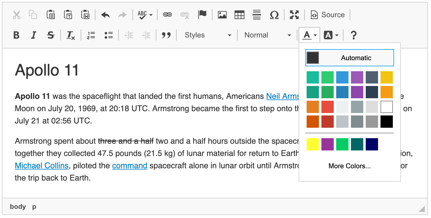
The number of colors that appear in the panel can be controlled using the config.colorButton_historyRowLimit configuration option. Setting this value to 0 allows to disable the feature entirely.
The color history feature, in fact, consists of two separate mechanisms to collect and display colors. The first one collects colors from the editor content at initialization time, while the second one adds them to the history dynamically whenever they are used.
# Color Suggestions
During the editor initialization, color history scans the editor content for all colors used as text and background styles and adds them to the color history rows in the color panel. The order of colors is determined based on the number of their occurrences (the one that appears most often will be displayed as the first one) and later on the order of appearance. This whole procedure happens only once during the editor initialization, so if the editor is loaded with colored content, you can use all the colors right away! This part of the feature can also be disabled using the config.colorButton_renderContentColors option.
# Preserving Picked Colors
Every time a color is used (either from the default color palette or from the color dialog), it is added to the beginning of the color history row:
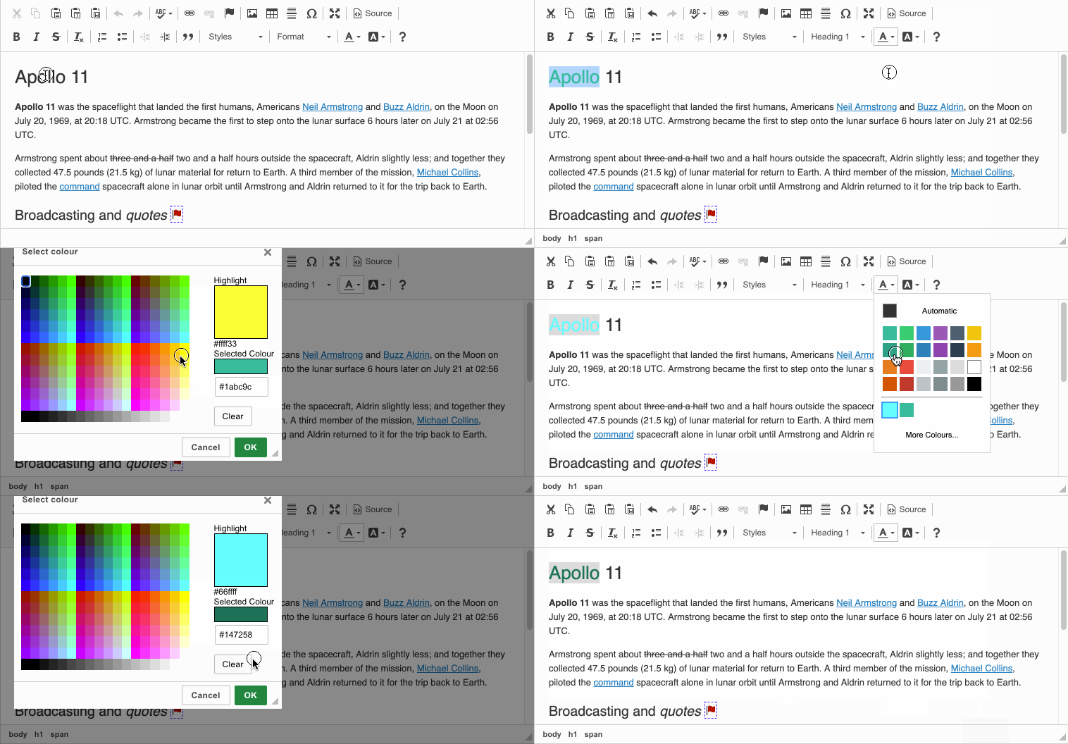
The most recently used color is always added to the beginning. If a color has already been present in the history, it is simply moved to the first position. Text and background colors are tracked separately, in respective color panels.
As mentioned earlier, there already may be some colors in the history even if you have not picked any yet, thanks to the Color Suggestions feature. The number of colors preserved in the history can be controlled using the config.colorButton_historyRowLimit configuration option.
# Text and Background Color Demo
See the working “Setting Text and Background Color” sample that showcases the usage and customization of the text and background color features.
# Related Features
Refer to the following resources for more information about text styling and formatting:
- The Using the Copy Formatting Feature article explains how to copy text formatting between document fragments.
- The Removing Text Formatting article explains how to quickly remove any text formatting that is applied through inline HTML elements and CSS styles.
- The Basic Text Styles: Bold, Italic and More article explains how to apply bold, italic, underline, strikethrough, subscript and superscript formatting.
- The Applying Styles to Editor Content article discusses creating more semantically correct text styles.
- The Applying Block-Level Text Formats article presents how to apply formatting to entire text blocks and not just text selections.


